CRO Case Study cover with descriptive text at the top left and images of the before and after lead forms in the case study's A/B test presented with the before being greyed out and a red trash icon in the middle and the after being larger in size and accompanied by an upward progression icon graphic to demonstrate its success over the control

Visual Persuasion: Optimizing Conversions for National Home Lending Company

To address underperforming CTAs on a subsidiary site, I redesigned the components to more clearly communicate the relationship with the parent company. By aligning the CTA's visuals with the parent brand, I aimed to reduce friction and clarify the transition to the parent company when completing the lead form.
Despite a technical issue discovered during A/B testing that impacted navigation, the new design's clarity was so effective that it still outperformed the control group. Upon full implementation, the functional design achieved an 89% increase in conversions, leading to a permanent shift in the company's cross-brand strategy.
Methodology
Design Strategy
Interaction Design
A/B Testing
Conversion Rate Optimization (CRO)

Preview

See the before and after designs for the subsidiary company CTAs.
*Visuals changed in mockups to hide client identity (NDA)

What difference did this change make?

jagged green arrow pointing toward the top right corner of the screen representing upward progression
89%
increase in qualified leads over two weeks
icon graphic made up a bar chart with four bars and the first bar is the shortest, leading to the tallest bar on the right in a even, progressive manner. On top of the graph is a green arrow curved in an upward direction to the right, following the steps of the bar graph
103.5%
increase in visit to lead form over 2 months

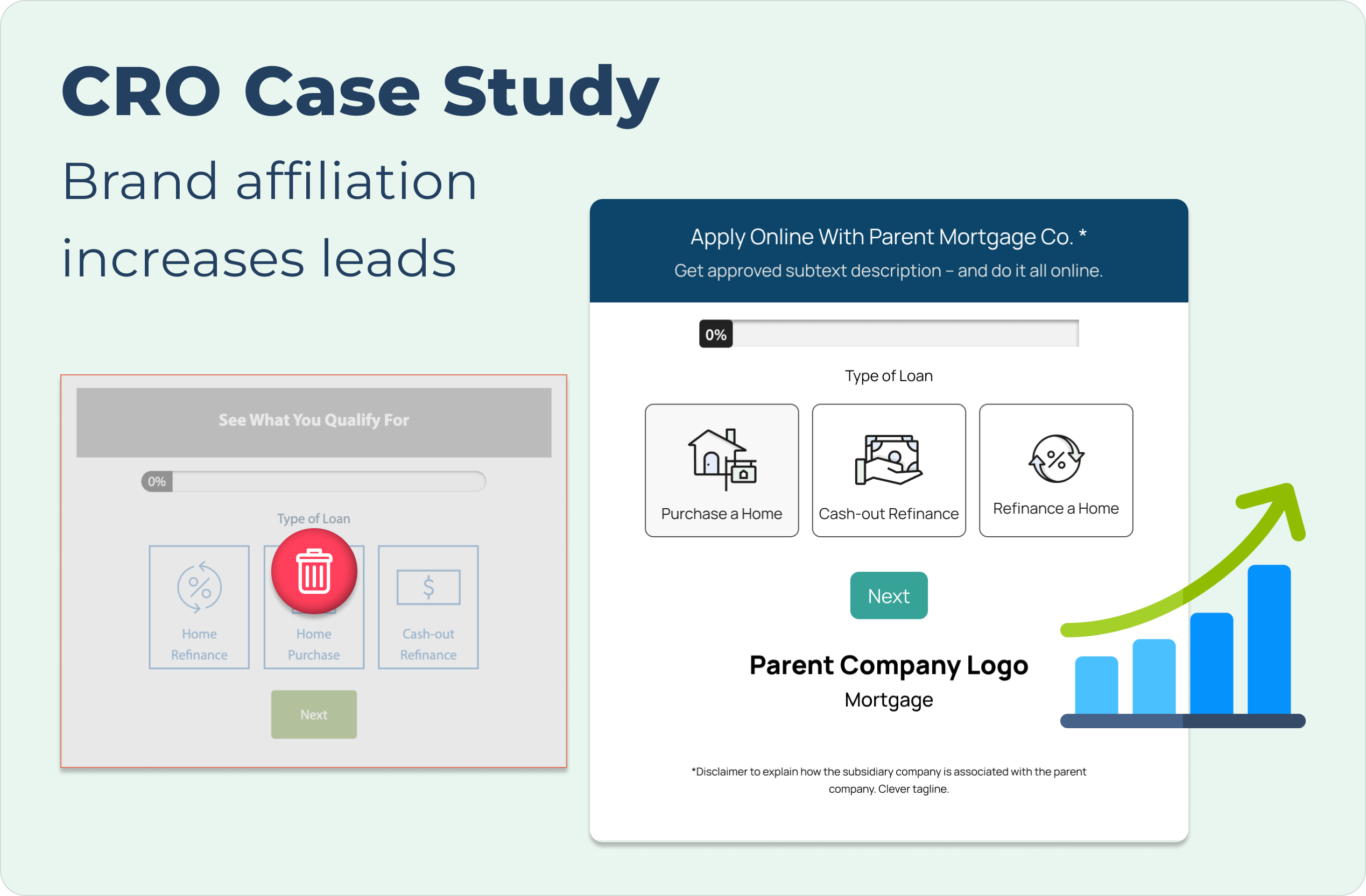
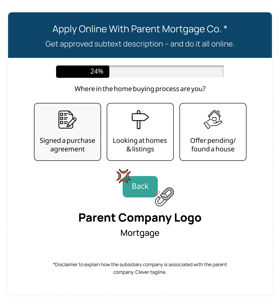
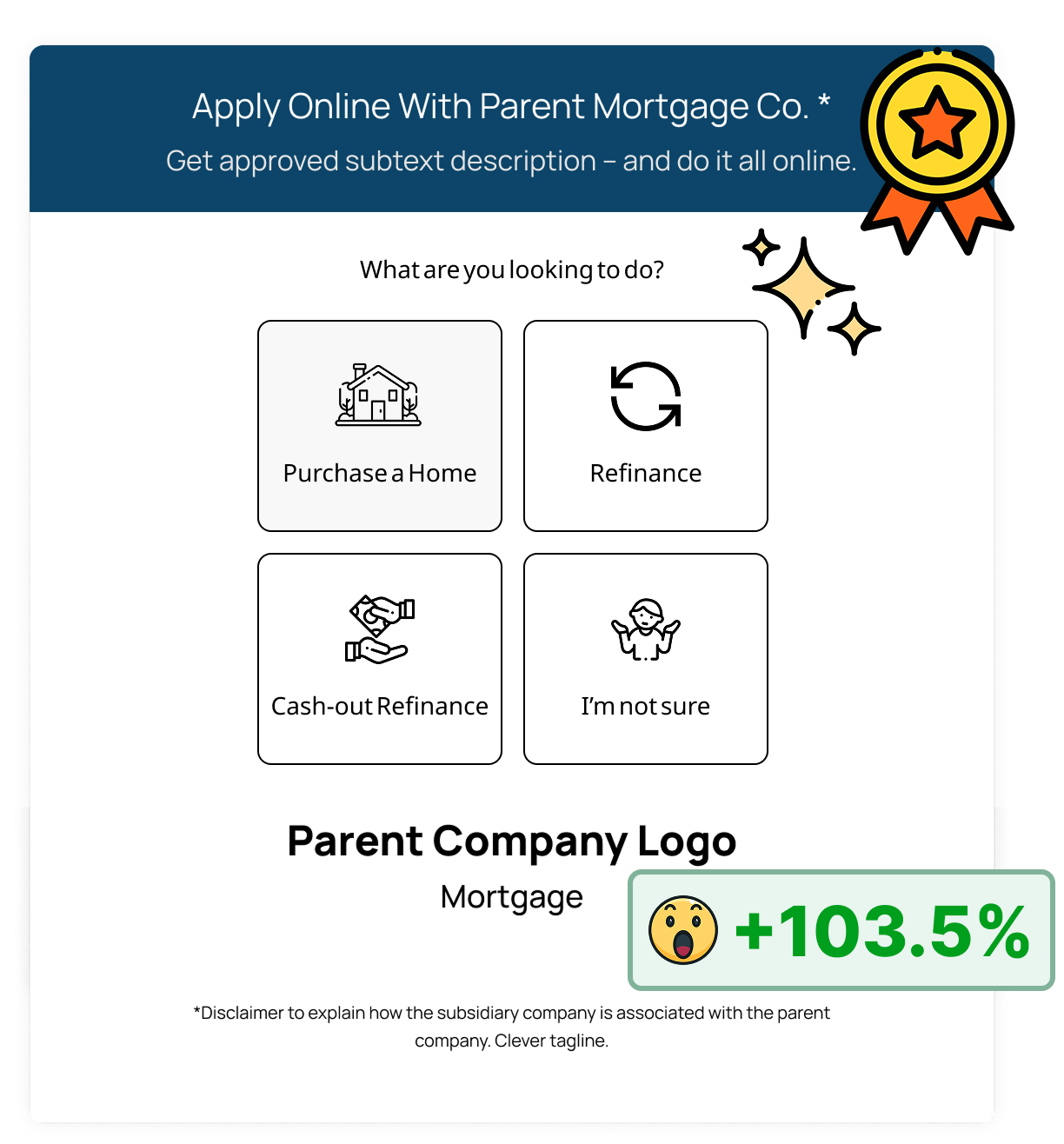
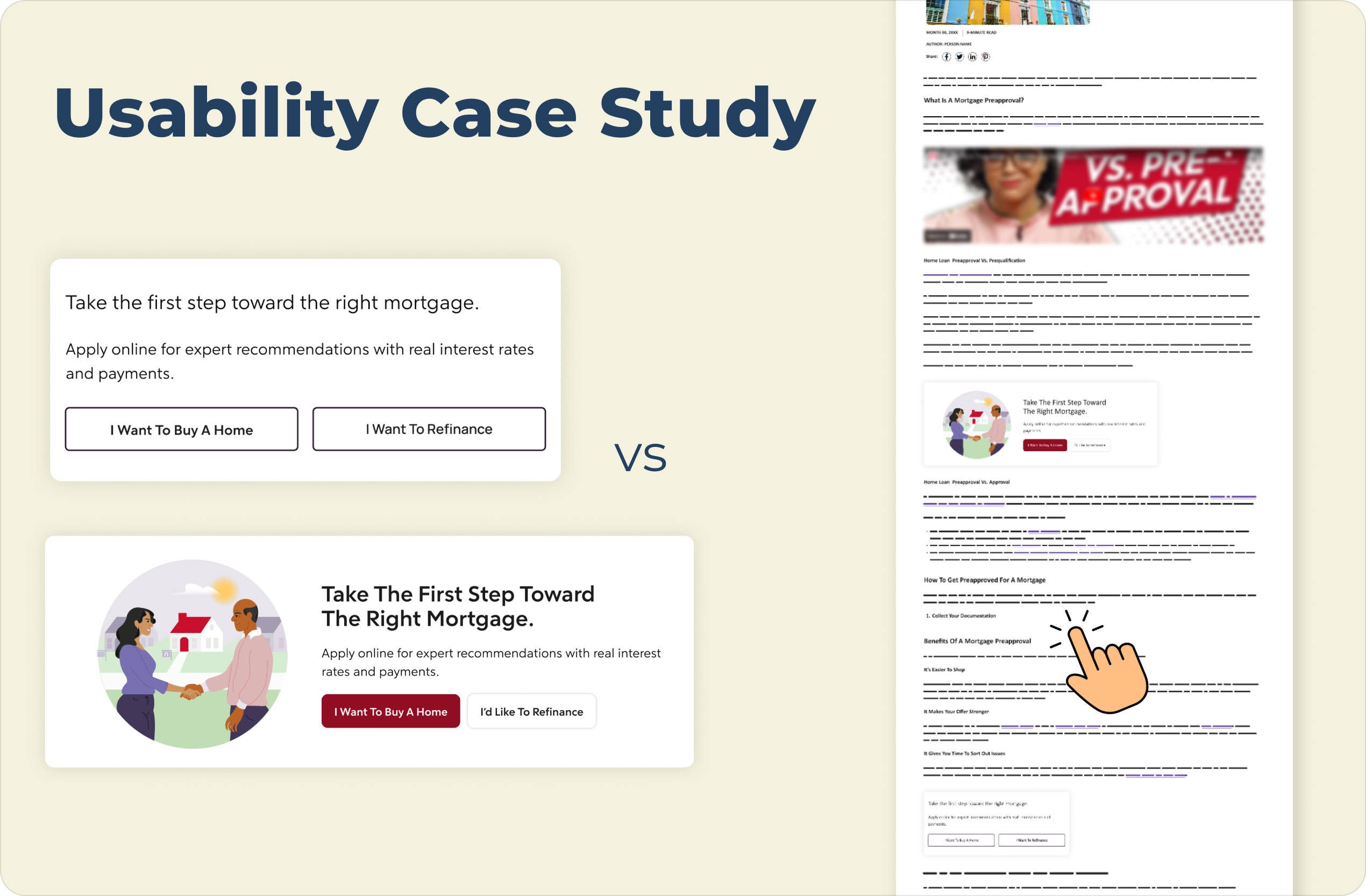
With a broken test showing signs of success, it was decided to move forward with implementing the new CTA design on high traffic pages within the subsidiary site. This showed a substantial increase in qualified leads, leading to the implementation of a similar design on a new CTA idea that showed even more increase in performance with lead forms.

How did we get there?

The Problem: Brand Disconnect
In the previous design, users on the subsidiary site of the parent company wouldn't necessarily know these two companies were affiliated until they interact with a CTA that would redirect users to the parent company page. Due to this disconnect and possible friction point, users weren't continuing in the conversion process through this flow.
*Visuals changed in mockups to hide client identity (NDA)
The Hypothesis: 
Building Visual Trust
In building a test to improve performance of the subsidiary site CTAs, I presented the idea to change the visual branding to match that of the parent site while communicating through logos, content messaging, and a disclaimer within the variant CTA. This design decision was made in an effort to make users more aware of the company realtionships and adjust user expectations to redirects.
*Visuals changed in mockups to hide client identity (NDA)
A/B Testing: 
I think we have a problem...
One week into the A/B test comparing the parent-branded variant against the subsidiary control, a technical error was identified: the variant's lead form prevented users from navigating to previous steps. While this error risked increased form abandonment and friction, the variant's superior engagement data justified the decision to continue the test to validate the underlying visual strategy.
*Visuals changed in mockups to hide client identity (NDA)
Launched parent branded test with broken back button after progressing through the lead form
The Results: 
Validating the Shift
Even with the technical limitation, the variant outperformed the control by 1.8%, validating the visual strategy. Once the navigation error was resolved, the design was deployed to high-traffic pages and showed an 89% increase in qualified leads over the next two week sprint timeline.

This success redefined the overarching design standard for this client. From this, we transitioned to a dynamic CTA format that routed users based on their intent, directing them either to a lead form or to guiding content depending on their selection. This refined interaction model continued to drive significant growth, ultimately yielding a 103.5% increase in lead form engagement.
*Visuals changed in mockups to hide client identity (NDA)
Improved usability form with parent page branding and new functionality of selecting one button shows 103.5% improvement of lead form visits

Check out my other projects:

Image for the Main Navigation Research & Design case study cover showing the label text at the top and featuring an open laptop with the screen displaying the navigation from the study to demonstrate what it would look like in practice and as a preview for the full case studypage optimization case study cover shows the information slightly greyed out with a large "Coming Soon" sign to indicate this is not yet ready for viewingAn image showing a usability case study comparison of a mortgage webpage, presented on a light cream background. On the left are two vertically stacked versions of a mortgage call-to-action block:

The top version is a "Control" with the title "Take the first step toward the right mortgage." text below that reads "Apply online for expert recommendations with real interest rates and payments.", and two side-by-side outline buttons with light gray backgrounds labeled "I Want To Buy A Home" and "I Want To Refinance".

The bottom version is a "Variation" in a wider, horizontal card with an illustration on the left of two people shaking hands in front of a house. The title on the right reads "Take The First Step Toward The Right Mortgage.", text below that reads "Apply online for expert recommendations with real interest rates and payments.", and two buttons below the text: a solid maroon button labeled "I Want To Buy A Home" and a solid white button labeled "I'd Like To Refinance".

A large navy blue title "Usability Case Study" is at the top left, and the text "VS" is centered between the two examples. On the far right is a vertical mockup of a complete webpage that includes a header, article text, and images, and features a hand pointer icon hovering over text and lines near the bottom.A woman leaning on a railing high above a the city of Hong Kong behind her with the words "Learn More About Me" featured in the top left corner of the image