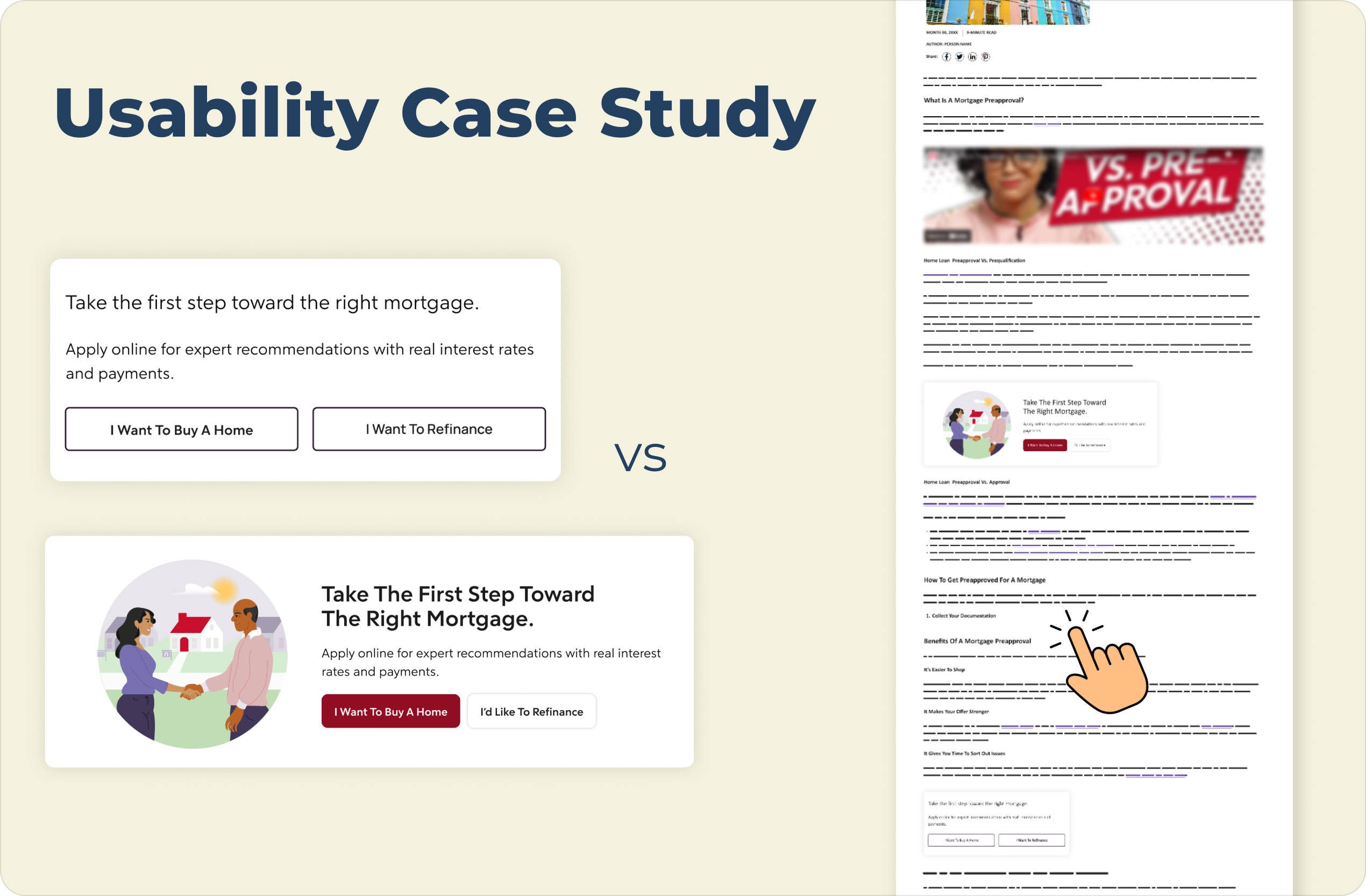

Information gathered from this study ended internal debates about aesthetic styles, allowing the team to focus on high-performing, context-rich placements that drive measurable results.
![A client CTA made up of a white box and red outline with the words "Tested. Trusted. Top-rated. Visit [client name] to get a proven real estate agent that's handpicked for you" with a red button under the text saying "Go to [client name]"](https://cdn.prod.website-files.com/6952ae315f51abdee1a50489/69c1cd5ef0f1e74fb45232f8_74111fbfe5aebe5be9f093f1e59962e6_Fail%20test%201.png)
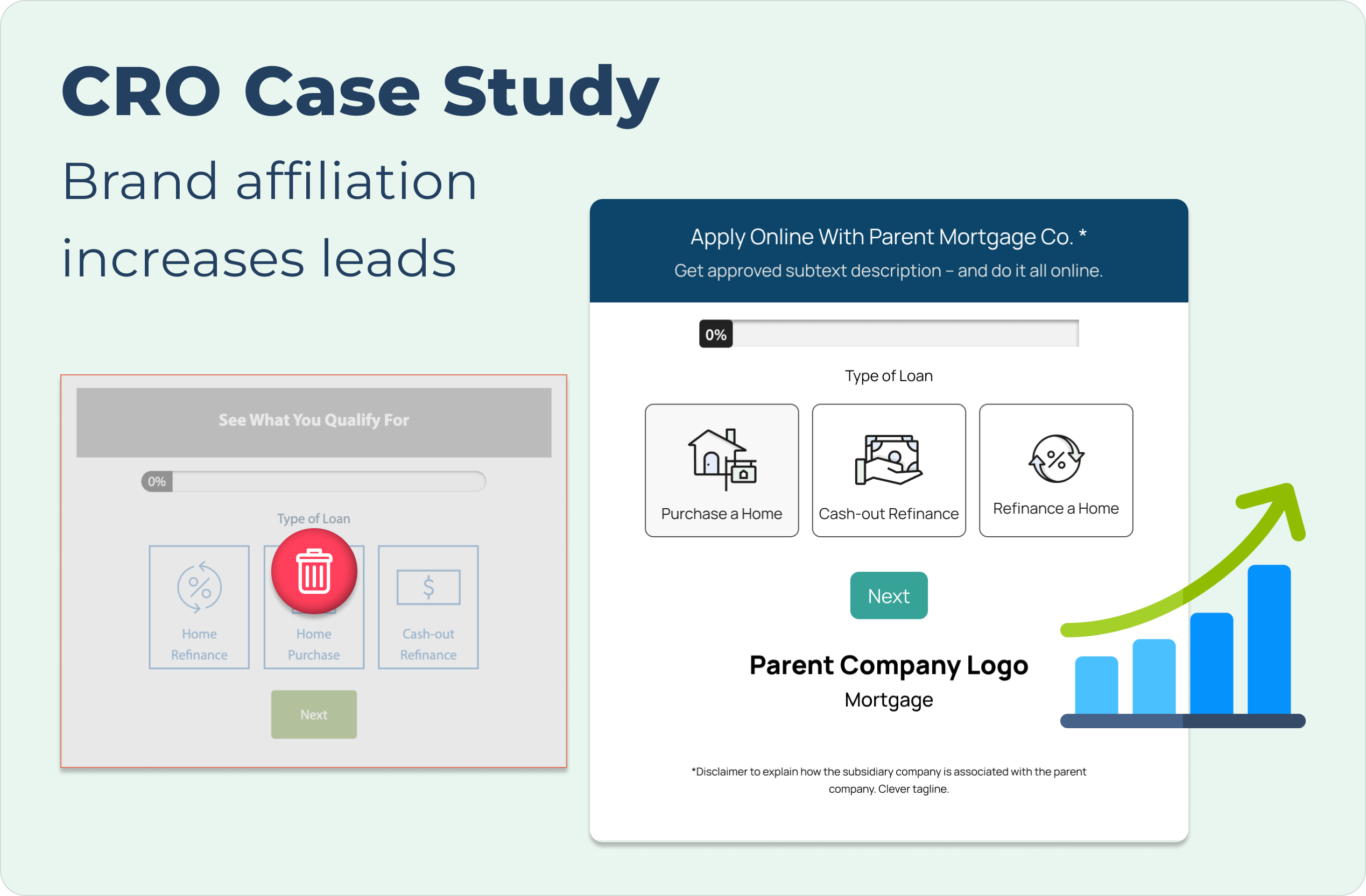
By observing how users navigated the page after reading, I was able to identify which design patterns proved to be most trustworthy and convenient to users during a high stress financial decision.


If you like what you see and want to work together, get in touch!
clarktiffany212@gmail.com