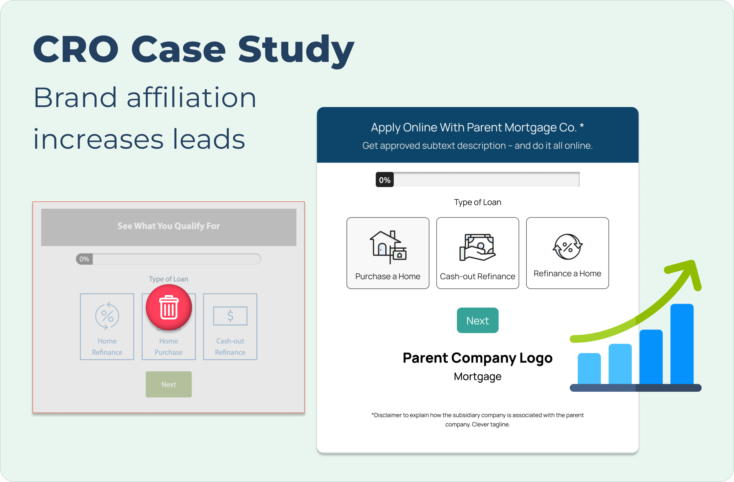
To address underperforming CTAs on a subsidiary site, I redesigned the components to more clearly communicate the relationship with the parent company. By aligning the CTA's visuals with the parent brand, I aimed to reduce friction and clarify the transition to the parent company when completing the lead form. To address underperforming CTAs on a subsidiary site, I redesigned the components to more clearly communicate the relationship with the parent company. By aligning the CTA's visuals with the parent brand, I aimed to reduce friction and clarify the transition to the parent company when completing the lead form.To address underperforming CTAs on a subsidiary site, I redesigned the components to more clearly communicate the relationship with the parent company. By aligning the CTA's visuals with the parent brand, I aimed to reduce friction and clarify the transition to the parent company when completing the lead form.To address underperforming CTAs on a subsidiary site, I redesigned the components to more clearly communicate the relationship with the parent company. By aligning the CTA's visuals with the parent brand, I aimed to reduce friction and clarify the transition to the parent company when completing the lead form.To address underperforming CTAs on a subsidiary site, I redesigned the components to more clearly communicate the relationship with the parent company. By aligning the CTA's visuals with the parent brand, I aimed to reduce friction and cl
To address underperforming CTAs on a subsidiary site, I redesigned the components to more clearly communicate the relationship with the parent company. By aligning the CTA's visuals with the parent brand, I aimed to reduce friction and clarify the transition to the parent company when completing the lead form. To address underperforming CTAs on a subsidiary site, I redesigned the components to more clearly communicate the relationship with the parent company. By aligning the CTA's visuals with the parent brand, I aimed to reduce friction and clarify the transition to the parent company when completing the lead form.To address underperforming CTAs on a subsidiary site, I redesigned the components to more clearly communicate the relationship with the parent company. By aligning the CTA's visuals with the parent brand, I aimed to reduce friction and clarify the transition to the parent company when completing the lead form.To address underperforming CTAs on a subsidiary site, I redesigned the components to more clearly communicate the relationship with the parent company. By aligning the CTA's visuals with ed to reduce friction and cl