Image for the Main Navigation Research & Design case study cover showing the label text at the top and featuring an open laptop with the screen displaying the navigation from the study to demonstrate what it would look like in practice and as a preview for the full case study

Main Navigation Research and Redesign for National Law Firm

By observing real-world user interactions with a law firm's navigation, I identified and implemented optimizations that reduced friction and improved the path to conversion.
The research study provided insight into pain points in the user journey, leading to the creation of a new navigation design with consistent dropdown menu options and more visibility for previously hidden or hard to find links and pages.
Methodology
User flows
Design strategy
Information Architecture
Interaction Design
Design Systems
UX Research:
• Usability Testing
• User Interviews
• Tree Testing

Preview

Check out the prototype of the finalized design presented to the client
*Client information not included due to NDA.

What difference did we make?

three gradient blue arrows with the darkest blue being the left-most arrow, grouped together to show progression
50%
reduction in steps to task completion
a short, winding path connecting a destination marker to a green flag
10%
increase in direct user paths

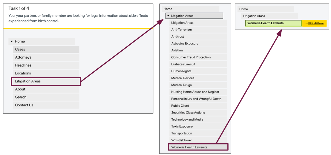
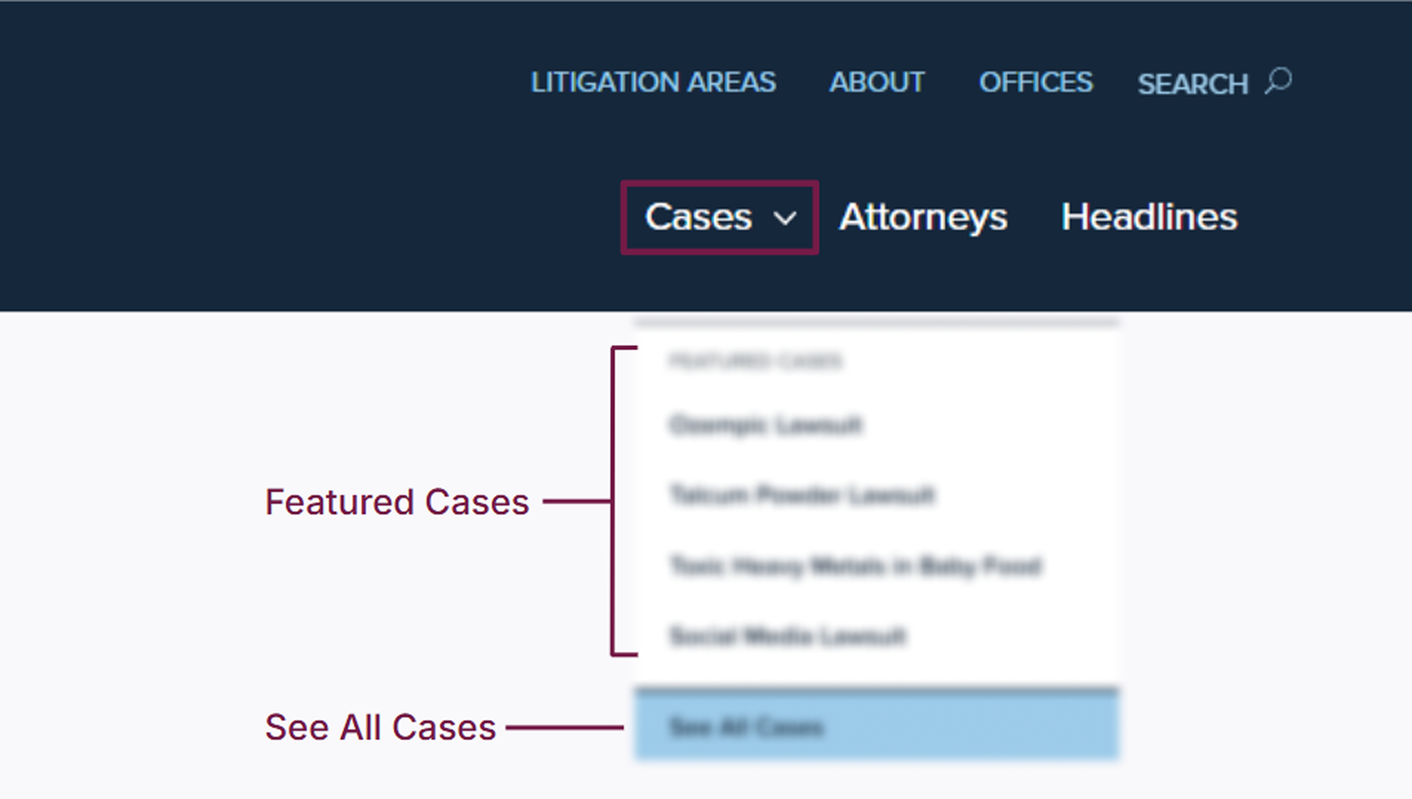
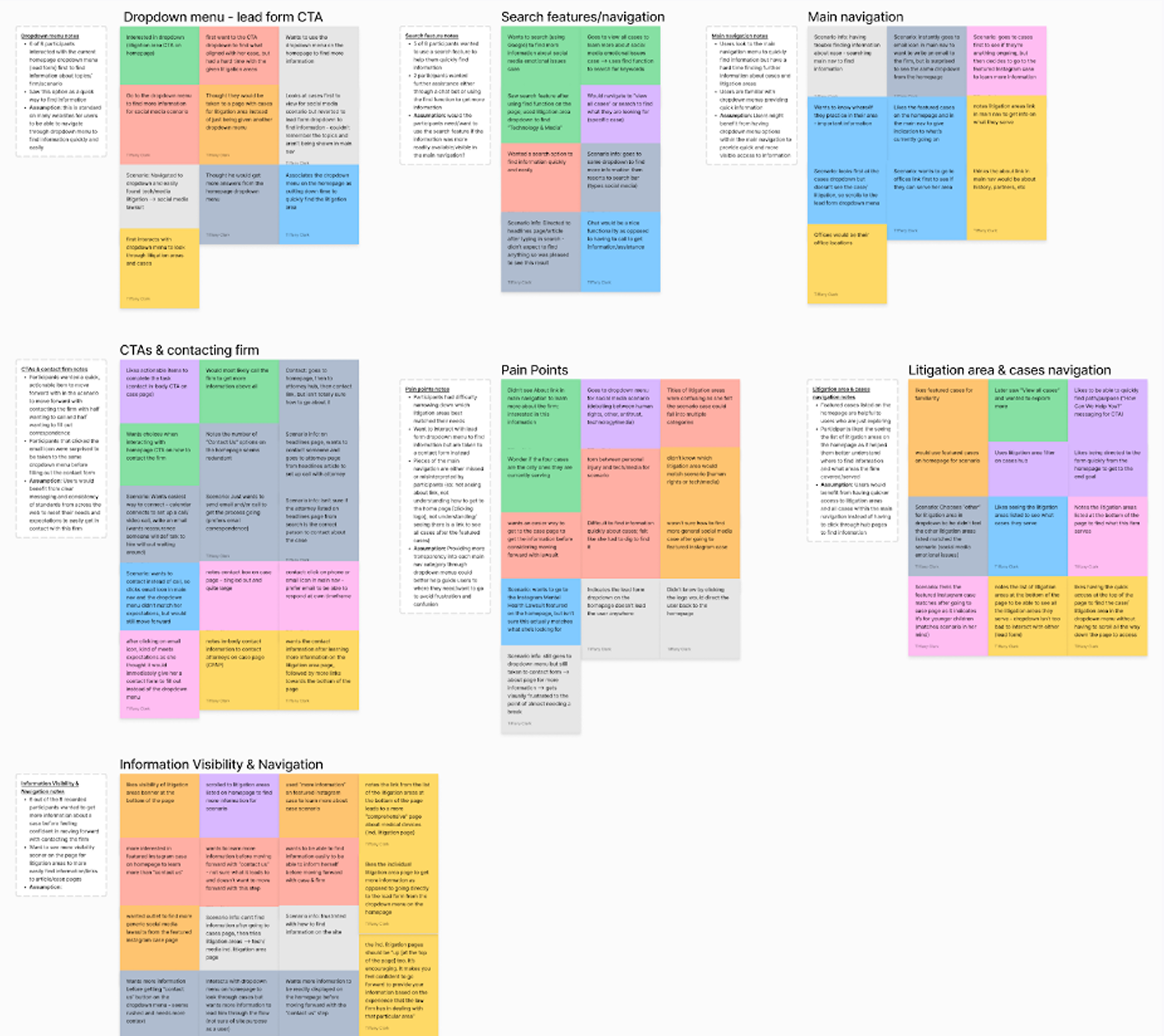
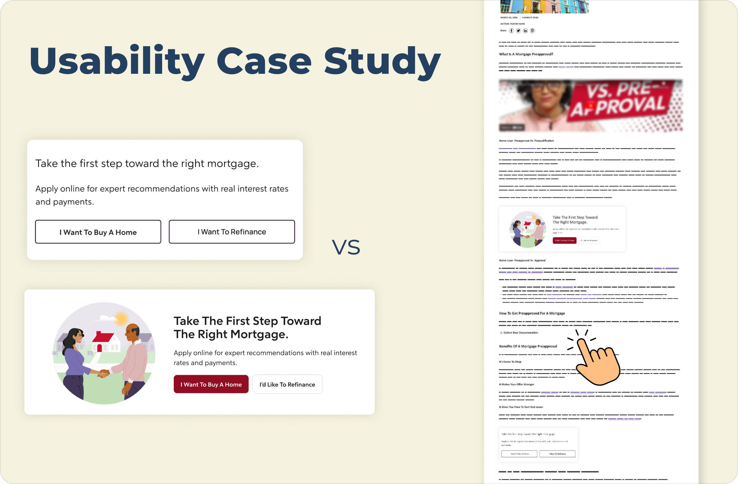
Using Optimal Workshop, three groups of users were given the same 4 tasks over multiple rounds. Each round, an improved version of the navigation was tested against the current navigation to find the optimal navigation structure to implement on the client site in order to reduce the number of steps and match user behaviors.

Three sets of navigation menus with the first being on the left, showing the top level of categories and the category "Litigation Areas" being selected to navigate to the next menu of all 18 litigation areas listed, but "Women's Health Lawsuits" is selected to open the last step in the process for choosing that page as a participant in this tree testing study

How did we get there?

The previous navigation provided only one dropdown menu
Prior preference testing revealed a mental model where dropdowns signify primary navigation. Lacking this convention on the current site outside of one option, users mistook lead-form menus as navigation, forcing users to dig through sub-pages for information and exposing a discoverability gap.
*Information blurred to hide client identity (NDA)
A blurred version of the client's current navigation structure consisting of links to "Litigation Areas", "About", "Offices", "Search" on the top and three more links in a larger text below the top links labeled "Cases", "Attorneys", "Headlines", with the only dropdown menu "Cases" open displaying unreadable featured cases (4 in total) and an unreadable button labeled "See All Cases"
Synthesizing User Insights Defines a Navigation Centered on Autonomy
I synthesized tree testing results and participant feedback using affinity mapping to identify behavioral trends. These insights led to the creation of a redesigned navigation that surfaced previously hidden links and removed navigational barriers.
groups of multi-colored digital sticky notes with unreadable text on each note. The groups of notes are organized into 7 groups with the following labels: Dropdown menu - lead form CTA, Search features/navigation, Main navigation, CTAs & contacting firm, Pain Points, Litigation area & cases navigation, and Information Visibility & Navigation
Two open forms of the new navigation featured on top of one another with the top navigation showing the category "Practice Areas" being open and displaying 16 possible practice areas in a four-by-four grid and a slightly offset link to the bottom right labeled "See All Practice Areas". The bottom navigation has the category "Cases" open, displaying 9 possible cases in a three-by-three grid with each link to the case page being supplemented with a three-line lorem ipsum description; slightly offset to the bottom left is a link labeled "See All Cases"
Research-Driven Navigation Increased Discoverability
I optimized the information architecture by aligning user behavior with client priorities to expand direct access to litigation areas and active cases that drive conversions. By elevating previously obscured "About" and "Locations" links, I established a verified hierarchy that ensures users immediately grasp the firm’s site structure and legal expertise.

How will these structural changes be validated?

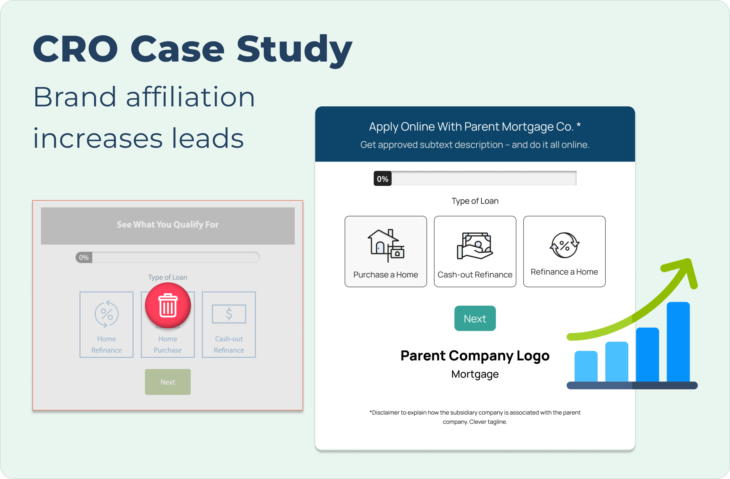
The redesign is currently in development for final client review. Post-launch, I will primarily track conversion rates and navigation clicks to quantify the impact of the new architecture, while casually monitoring bounce rate as a secondary baseline for site retention.

a funnel with 3 people inside narrowing to a money coin. next to the funnel is a blue arrow pointing up to demonstrate conversion rated improving

Conversions

study user paths from navigation to lead form
a yellow arrow with lines around the point of the arrow indicating the arrow is clicking

Clicks

heatmaps and click tags to verify engagement

Check out my other projects:

CRO Case Study cover with descriptive text at the top left and images of the before and after lead forms in the case study's A/B test presented with the before being greyed out and a red trash icon in the middle and the after being larger in size and accompanied by an upward progression icon graphic to demonstrate its success over the controlpage optimization case study cover shows the information slightly greyed out with a large "Coming Soon" sign to indicate this is not yet ready for viewingAn image showing a usability case study comparison of a mortgage webpage, presented on a light cream background. On the left are two vertically stacked versions of a mortgage call-to-action block:

The top version is a "Control" with the title "Take the first step toward the right mortgage." text below that reads "Apply online for expert recommendations with real interest rates and payments.", and two side-by-side outline buttons with light gray backgrounds labeled "I Want To Buy A Home" and "I Want To Refinance".

The bottom version is a "Variation" in a wider, horizontal card with an illustration on the left of two people shaking hands in front of a house. The title on the right reads "Take The First Step Toward The Right Mortgage.", text below that reads "Apply online for expert recommendations with real interest rates and payments.", and two buttons below the text: a solid maroon button labeled "I Want To Buy A Home" and a solid white button labeled "I'd Like To Refinance".

A large navy blue title "Usability Case Study" is at the top left, and the text "VS" is centered between the two examples. On the far right is a vertical mockup of a complete webpage that includes a header, article text, and images, and features a hand pointer icon hovering over text and lines near the bottom.A woman leaning on a railing high above a the city of Hong Kong behind her with the words "Learn More About Me" featured in the top left corner of the image